Data Visualization / Data Analysis / ArcGIS
Mapping NYC Farmers Markets & Produce Stalls
A centralized map of NYC farmers markets built with open data and scraping tools
Research Question
How can I build and develop a data repository or system that can power a product or website where users can find everything they’re looking for when it comes to farmers markets and healthy produce?
Data I needed:
Market name
Address/location
Hours of operation
Seasonal/dates open
Whether it accepts EBT
If there are farmstands or cooking demos
Food scrap or textile drop-off options
Current Problem:
When you search "farmers market near me," most of the results are completely off.
You might get a grocery store, a florist, or maybe one real farmers market mixed in. Even sites like GrowNYC, while helpful in some ways, aren’t centralized or easy to use. GrowNYC had a lot of great information, but it’s spread across PDFs, blog posts, maps, and dropdowns filters. Their “interactive” map is limited, not intuitive, and doesn’t always show helpful details.
Tools Used
ArcGIS Pro, ArcGIS Dashboard, Python, BeautifulSoup, PyPDF2, pdfminer, NYC Open Data, web scraping, PDF extraction, HTML inspection, CSV cleaning,
Gathering Data:
Step 1: Web and PDF Scraping
I started scraping GrowNYC PDFs using Python. I used pdfminer and requests to pull content from PDF links, but it was kind of messy and I wasn't getting all the information I needed. I switched to PyPDF2 for reading downloaded PDFs, which worked way better and gave me access to names, boroughs, addresses, and dates.
Step 2: Scraping Web Pages
I used BeautifulSoup to scrape HTML from websites like Harvest Home, which had market listings by borough. The website included farmers markets and stalls that were not on GrowNYC's dataset. I had to inspect the page structure closely to figure out how things like names and hours were formatted and how to target them properly with Python.
Some data points were easy to get, like hours and addresses. Others, like cooking demonstrations, were harder because they weren’t consistently labeled. Some markets had "cooking demonstrations" listed, while others did not.
Step 3: Using Public Datasets
I’m also using the NYC Open Data Farmers market dataset. It doesn’t have everything I need, so I’m combining it with what I’ve scraped.
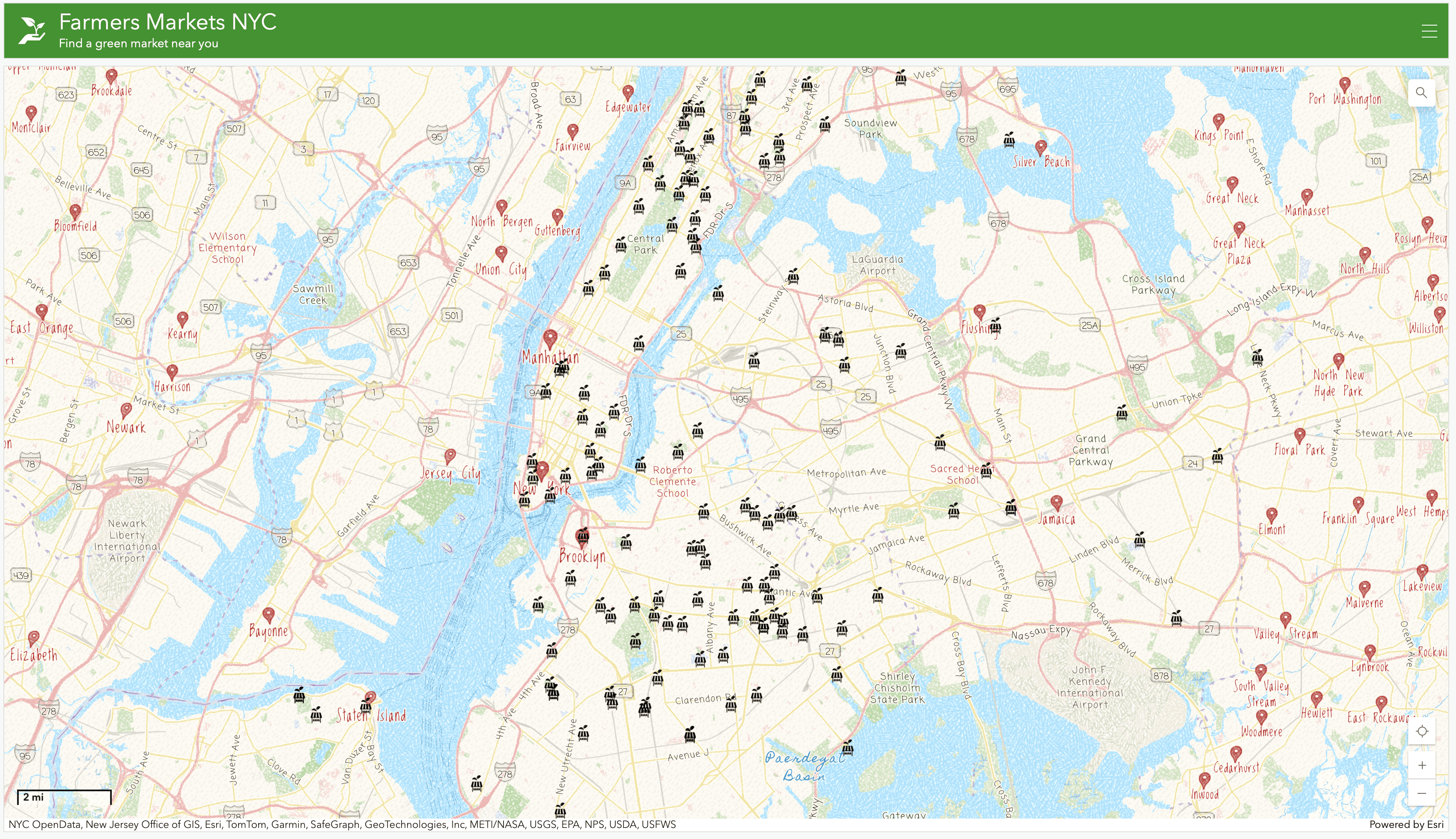
Mapping the Data
Once I had enough clean data, I imported everything into ArcGIS Pro. I uploaded my CSV and used mapping tools to visualize market locations, days open, EBT availability, and more. I grouped the data to highlight specific boroughs and features.
Final Output: ArcGIS Dashboard
For the final step, I used the ArcGIS Dashboard feature to create an interactive web map. Users can click on a market icon and immediately view:
Name
Address
Borough
Hours
Dates open
Whether they accept EBT
If they offer cooking demos
Latitude/Longitude and Zip Code
The dashboard is simple, intuitive, and built to solve the exact problem I started with.
When a user clicks on a farmers market icon, the dashboard displays detailed information including hours of operation, EBT acceptance, cooking demos, and location data.
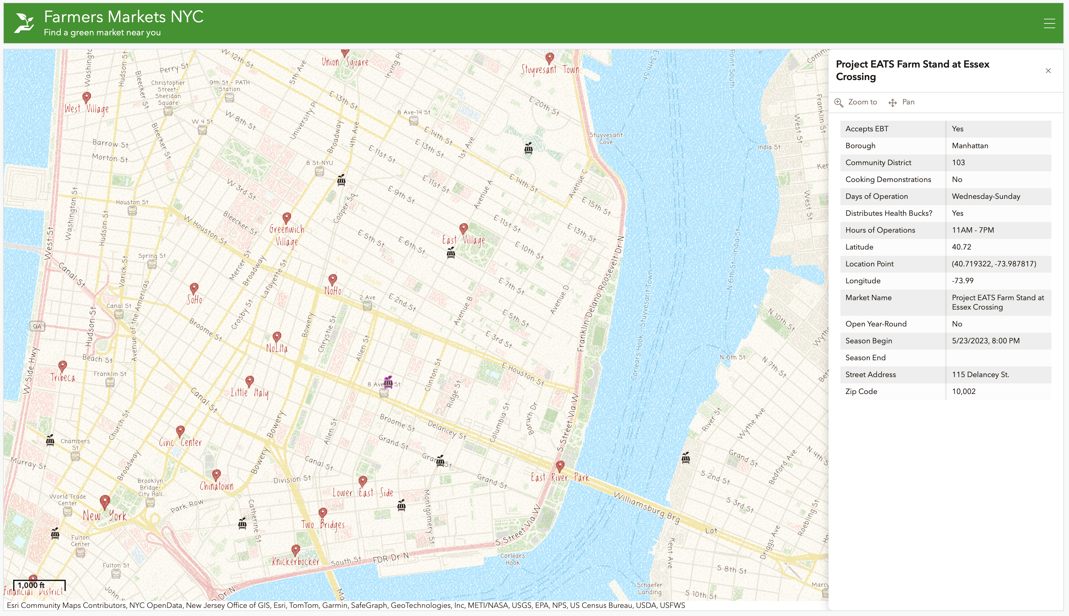
Clicking on any market icon opens a full profile with all the essential details someone would need to decide if they want to visit that market.
©2025