A Usability Deep Dive into LinkedIn’s Design
Exploring LinkedIn’s User Experience on Desktop: A Critical Analysis Through the Lens of Don Norman’s Design Principles
LinkedIn is my daily go-to social media platform. I check it first thing in the morning, a few times a day, and then once before bed. Back in college, advisors pushed us to set up a LinkedIn profile for networking, and I took their advice.
Starting out, I didn’t know all the ins and outs, but after about a year, I was fully immersed — using LinkedIn Learning, messaging professionals I didn’t know, joining groups, diving into polls and discussions, along with a bunch of other things.
At one point, I was on LinkedIn multiple times a day, spending a good chunk of time reading profiles and messaging people with careers I admired. It became my hub for connecting, learning about career paths, and understanding how skills transferred from one role to another. But by spending a lot of time on different features, I encountered challenges with certain aspects that seemed unclear to me.
Problem 1: Restricting Messages to People You Haven’t Connected With
Restricting messages was one of the many things that bothered me a lot when I was trying to grow my network. Specifically, restricting users who use the non-premium version of LinkedIn to message someone they’re not connected to. You can only do that when you are subscribed to LinkedIn Premium.
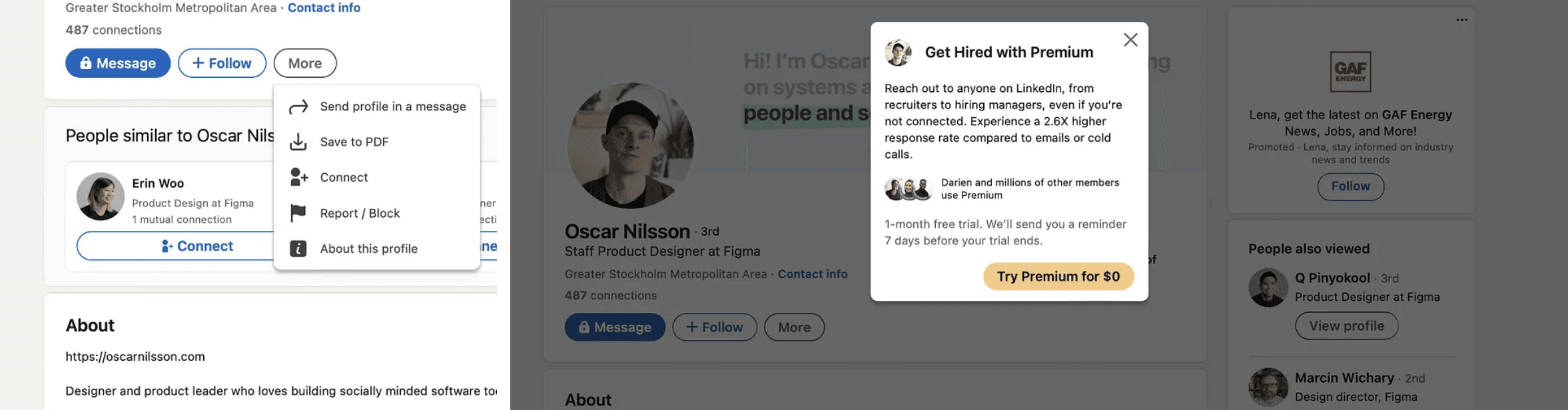
In 2023, LinkedIn boasts an estimated one billion users, with around 175.5 million enjoying premium access, roughly 18% of the total user base. For free users, there’s a notable limitation influencing their platform behavior, particularly in terms of initiating communication with new connections.
The idea of restricting certain features or functionalities behind a premium or paid subscription model aligns with the concept of “constraints” as discussed by Don Norman in his book, “The Design of Everyday Things”. Constraints are limitations intentionally placed in the design to guide users’ behavior, prevent errors, or encourage specific actions.
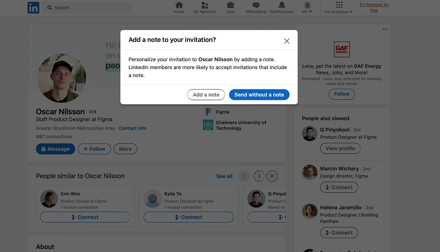
The primary means of reaching out to someone you don’t know without LinkedIn Premium is by sending a connection request. Though, you do have an option to personalize your invitation with a note, limited to 200 characters. That doesn’t leave much room to convey your message or explain why you want to connect.
In this scenario, the main goal was to prompt particular actions and shape user behavior, aiming to present the user with the option of upgrading to a premium membership for enhanced opportunities.
At best, you can introduce yourself succinctly and express your desire to connect for questions or specific requests. Alternatively, you can opt for a more casual approach, simply asking to connect. Once the connection is established, you gain access to the full messaging capabilities on the platform. This is one way I have been utilizing the “Add a note to your invitation” feature without having to pay a premium to message new people.
As someone who opts not to pay for the premium subscription, I rely on this feature to message individuals, hoping they’ll accept my request for ongoing conversation. Luckily, I may do it only a few times a week, and I don’t mind sending a short, concise and personalized note to the people I want to connect with. However, for others, this limitation can seriously impede their ability to reach out to multiple people simultaneously with questions, concerns, or vital information.
In a scenario like sales, where meeting quotas is crucial, LinkedIn Premium could be a game-changer. It would enable me to streamline the process by copying and pasting my message to numerous recipients without the necessity to connect individually. The 200-character limit wouldn’t apply, allowing me to communicate my message effectively. This approach not only saves time and resources but also proves advantageous for handling communication on a larger scale if needed.
Problem 2: Lack of Intuitive Access to Saved Content
Another limitation I faced often was the save feature. On Linkedin, you can save only three things; other people’s posts, Linkedin learning module courses, and job roles. All of these three things are found in various sections on LinkedIn.
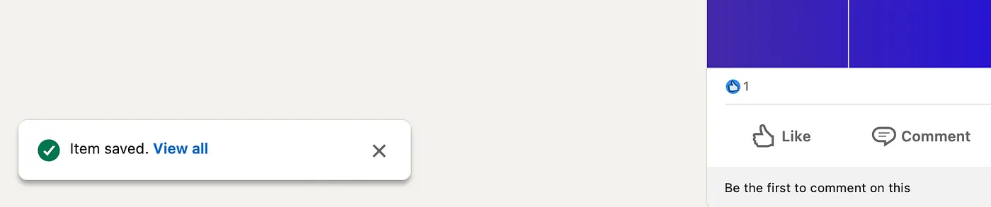
Posts: On your main feed is where you see all your posts from your 1st, 2nd and 3rd degree connections. You can click on the three vertical ellipsis on the top right of each post which will show you more options. Once that’s clicked, you can save the post. After that, you get a notification on the bottom left corner of your feed that states that the item has been saved, with a hyperlink to view all. Clear and immediate feedback is crucial for this workflow.
Learning Modules: LinkedIn Learning is a different application that is part of LinkedIn. In the past, I have personally not been able to find courses on the LinkedIn search tab, so I have always just google “LinkedIn Learning” and sign in through the first link I find on the google search engine page.
After some digging around in the header, I found that LinkedIn learning is under the “for business” tab. This user flow underscores a visibility and accessibility concern. It seems counterintuitive for a learning platform for users to be nested under the “For Business” tab, potentially leading users, like myself, to bypass it altogether.
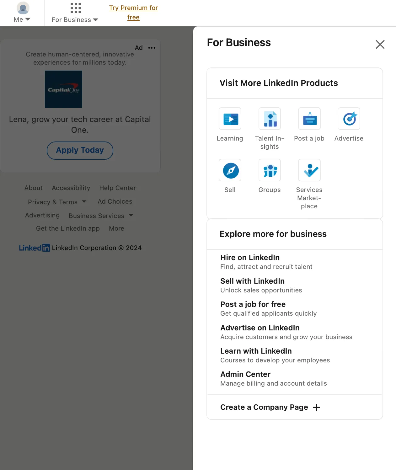
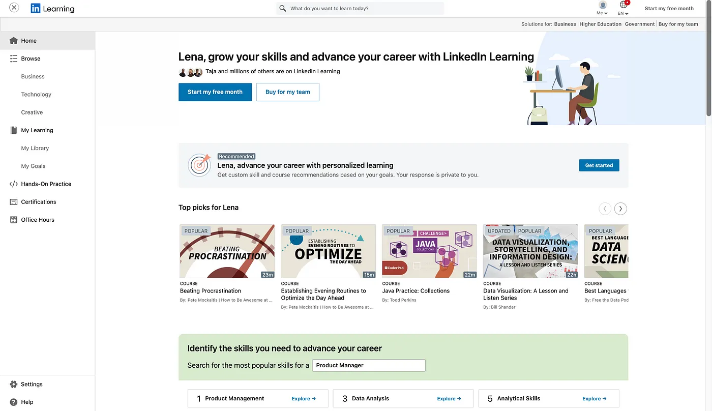
Once that’s clicked, a panel on the right side opens up, and under “For Business’, I found the Visit More LinkedIn Products header, where there are a few icons listed underneath, one of them being LinkedIn Learning. Once that’s clicked, it sends me to the LinkedIn learning platform on a new tab, which I know is related to Linkedin since the icon is there, but it looks like another platform entirely, even though the link reads
“https://www.linkedin.com/learning/”. There is also no visible option to go back to LinkedIn from the LinkedIn Learning page. You can only exist out of this tab.
Jobs: This one is the easiest features to access. On the header, there is a “Jobs” icon, where once the user clicks on it, you’ll get a variety of sections available to you that deal with anything related to jobs. On the lower left section, there is a tab with multiple options to choose from, the top one being a saved icon with the words “My jobs”. The user can infer that this refers to their saved jobs. Once thats clicked, a new page opens up, with the default preview being saved jobs. On the left side of the main feed, the user sees all their items that have been saved, which include posts, learning modules, and jobs.
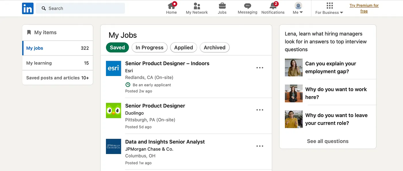
The current approach, tucked away within the “jobs” section, is not only awkward but also goes unnoticed by many users. I stumbled upon the location of my saved items inadvertently while navigating the job section, where I intended to find my saved jobs but unexpectedly discovered a tab housing all my saved items.
Alternatively, the second method involves navigating to your personal page, scrolling down to access “resources,” and then clicking on “my items.” Both routes demand a minimum of 3–4 clicks, assuming you start from the homepage when attempting to retrieve your saved content. These are the only two options that I know of to access saved items, there very well could be more.
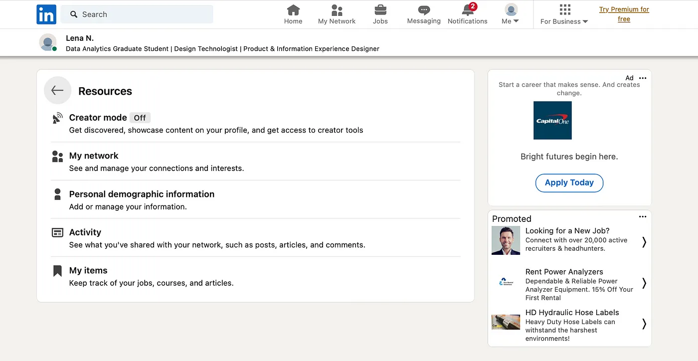
This issue relates to the concept of affordances and mappings. The design fails to provide a clear signifier or mapping for users to easily discover and access their saved items.
I believe LinkedIn should enhance the affordances and mappings for saved content, aligning with the user-friendly approaches employed by other applications on desktop. Ideally, it should be accessible with just one or two clicks from the home page or be intuitively placed somewhere on the user’s profile.
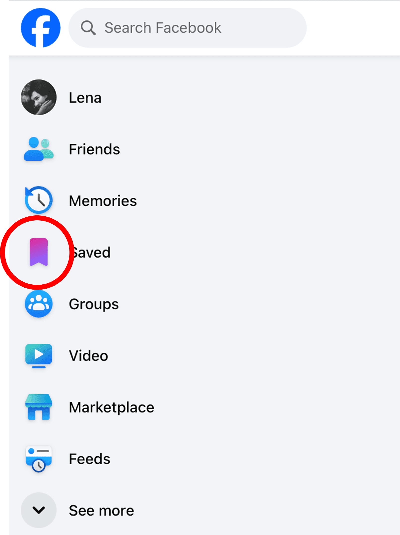
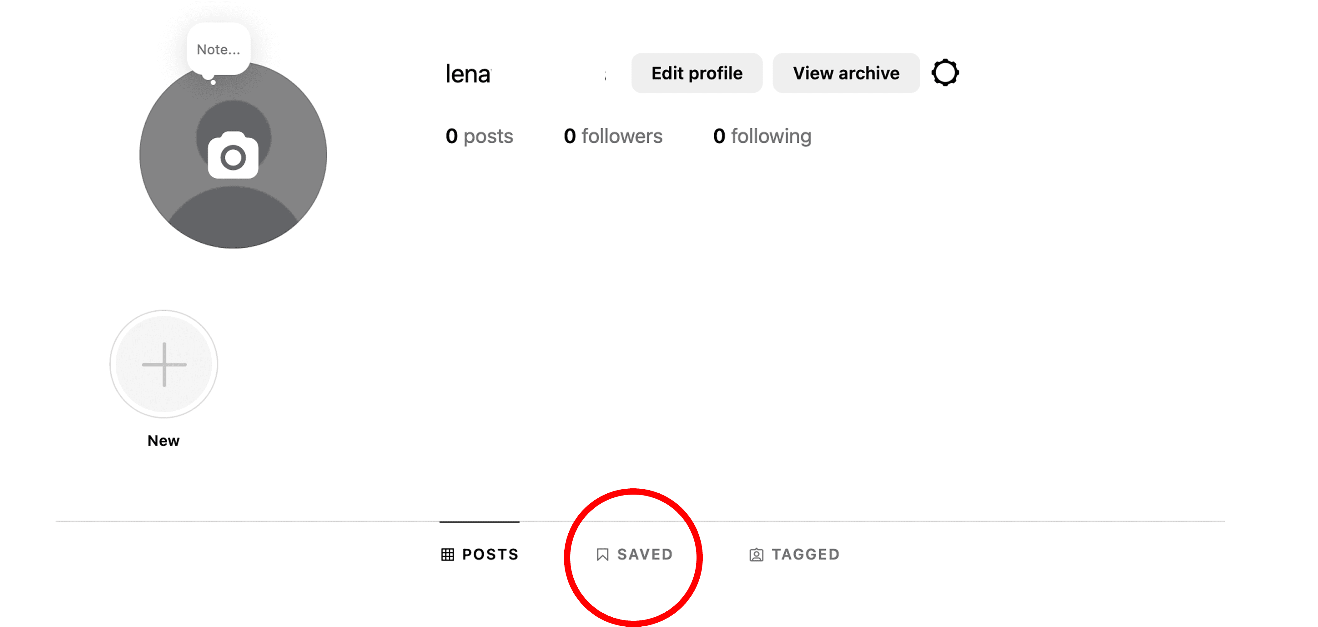
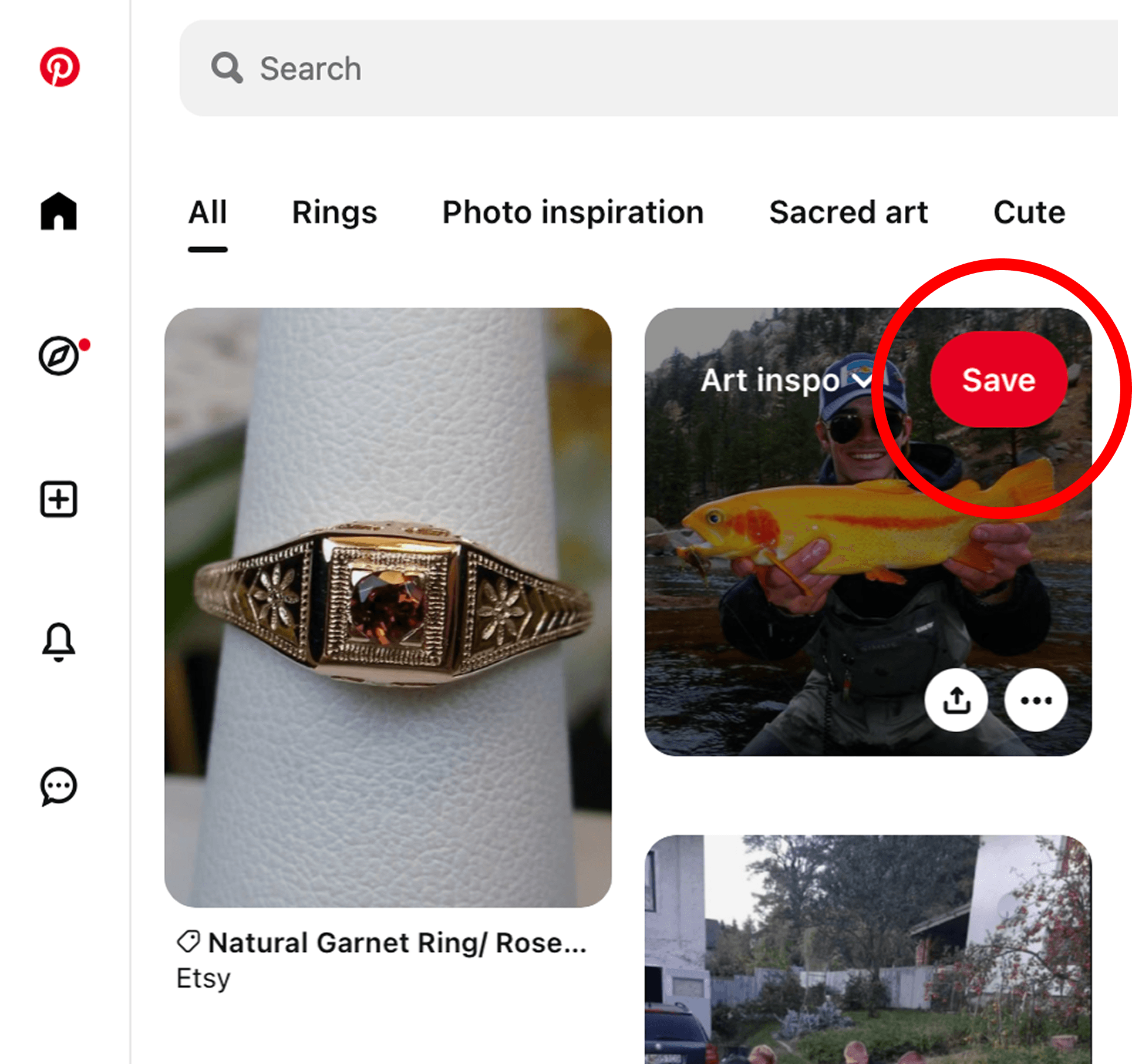
Take Facebook, for instance. When you’re on the homepage, there’s a clearly visible “saved” icon in an open panel on the left side. A single click, and I can access everything I’ve saved. Similarly, on Instagram, from my homepage, I click on “profile,” and there it is, the “saved” icon. Just two clicks, and I’m viewing all my saved items. On Pinterest, I can hover on any image to save it, or, with a simple click to my profile page from the homepage, and I’m immediately presented with all my saved items. These examples illustrate the simplicity and accessibility of placing something as crucial as “saved items” in an intuitive way.
Having a dedicated and prominently placed “saved” section in the main navigation menu, where users can quickly access their saved jobs, learning modules, and posts without navigating through unrelated sections like Jobs would be a great way to improve this issue on LinkedIn. This change aligns with the principle of providing clear cues and intuitive mappings for users.
It’s also something that users will view often, which would mean that putting it in a clear and viewable place would be ideal for easy access. By offering clear cues and ensuring elements are easily discoverable, users can better comprehend how to interact with a system.
Problem 3: Inefficient Content Organization and Discoverability
Another critique is that LinkedIn’s current design may pose challenges in efficiently organizing and discovering relevant content. Users may find it difficult to locate specific posts, updates, or articles, hindering their ability to stay updated with valuable information in their professional network. I have also noticed many of my connections complaining that they don’t see certain posts or updates, and that they either have to filter through their feed to find things, or only see them at the top of their feed once someone else interacts with those posts. This aligns with the concept of mapping and visibility. The relationship between users’ intent to find specific content and the available controls or features for content discovery may not be intuitive. Additionally, critical information (like posts and articles) might lack the necessary visibility, making it harder for users to locate valuable content.
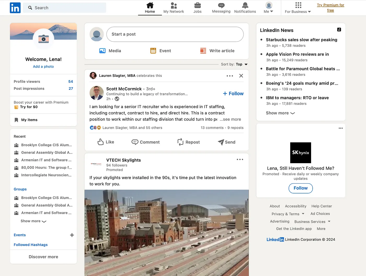
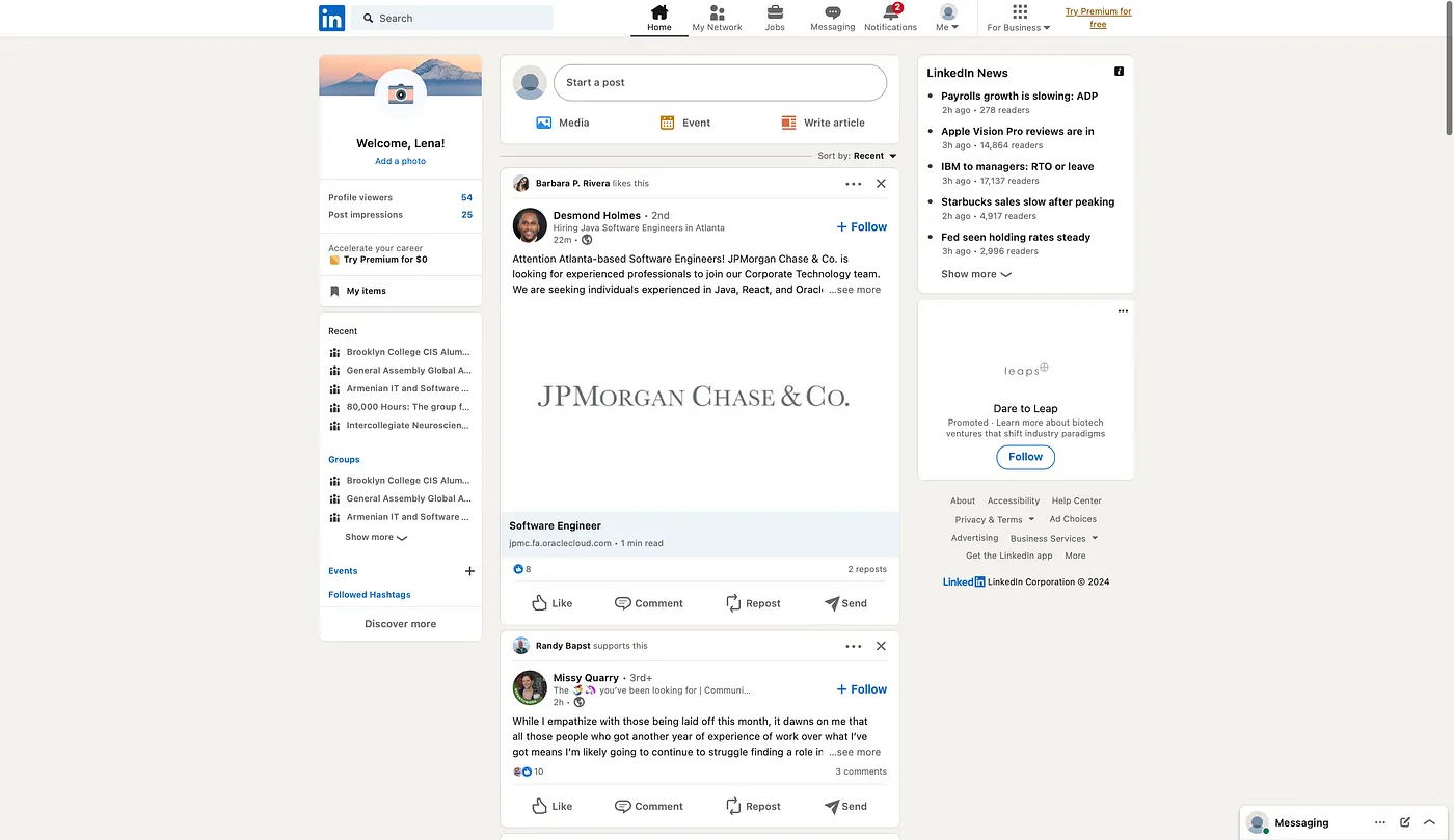
Currently, LinkedIn features a feed divided into three sections. The central feed moves in sync with your scrolling, while the left feed comprises two sections: the top one displaying profile information and the bottom dedicated to the groups you’re involved in. On the right, there’s the LinkedIn News tab and below it, a frequently updated sponsored post.
Notably, when you scroll, only your main feed and the sponsored post remain fixed. LinkedIn could significantly enhance the organization and discoverability of content by focusing on the cornerstone of its platform — the main feed.
Implementing more robust content filters that empower users to sort their feed based on specific criteria like relevance, industry, or content type would be highly beneficial. This feature allows users to customize their feed to align with their professional interests. Currently, the default view is set to “top,” with the alternative being “recent.” The top feed tab predominantly displays posts with high interactivity or those from 1st-degree connections.
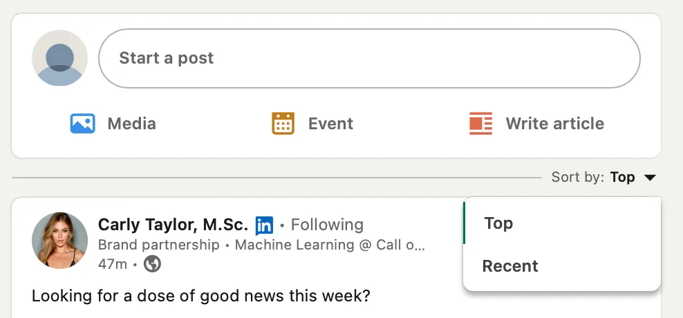
On the other hand, the recent tab showcases all posts and reactions that are recent. It’s not uncommon to encounter posts from weeks ago resurfacing due to recent interactions. This has resulted in situations where a friend or colleague engages with a post regarding a job listing, and upon clicking, I find that the job is no longer accepting applications or the link is broken. When I check back to the post, I notice that the reaction was recent, but the post itself dates back to three weeks ago. This lack of intuitiveness can be confusing.
In this scenario, affordances, signifies, and feedback can be helpful in understanding these challenges. The platform should afford clear actions to users, indicating how they can interact with posts, job listings, and other content. If a post is not current, it should not give the impression of recent activity. Affordances should align with the actual state of the content. Clear signifiers should guide users in understanding the relevance and timeliness of posts.
For example, a visual cue indicating the recency of interactions versus the original post date would help users avoid confusion. Users need prompt and precise feedback on their actions. When they engage with a post, there should be feedback conveying the real-time status of the job listing or the accessibility of the provided link. This ensures that users can make well-informed decisions when clicking links, existing out of linkedin, or moving onto a different page. While some posters conscientiously update their posts with a noticeable “UPDATE” in bold, signaling that the job position (or any other post) is closed or filled (or unavailable), this practice is inconsistent and unreliable.
And back to the main feed — I’ve never utilized the left section to check the groups I belong to, as it doesn’t provide much utility for my needs. The LinkedIn News headers rarely capture my interest, and I tend to disregard the sponsored post on the right side. A significant portion of this screen real estate remains unused, overlooked, and untouched. Recommending a customizable feed feature would be beneficial, allowing users to tailor their experience by including sections that matter to them, such as a dedicated area for saved posts, job listings, and other relevant content.
I believe there is room for improvement in various features on LinkedIn. The critiques I’ve expressed are personal observations, supplemented by anecdotes and insights gathered through social listening. Implementing these improvements could prove beneficial, particularly given the prevalence of complaints directly related to LinkedIn. I believe many of these changes would improve the usability and experience for many users on LinkedIn.
©2025